SandersSketches Website!

Assignment 1: Online Publication & Promotion, Professional Development

https://www.sanderssketches.com/

Above is a link to my professional website with all the relevant sites including my; Art Instagram, Artstation and Linkedin profile. This website will be used as a medium of promoting my professional artwork and animation. This will allow me to put my work online and hopefully get visitors who will like to see my work and perhaps see me as potential for a job.

SandersSketches Logo Design #4

Assignment 1: Online Publication & Promotion, Professional Development

Below are some different sketches where I have used my previous design as reference, but altered so that these designs have a different angle or pose, to help expand my design ideas. The first image below is a development where I have made a alternative angle of the previous design, by flipping this caricature to see how it would look. But the issue with this design is that it seems to look quite rounded especially in the cheeks.

sanderssketches_design_2_logo_v1

Therefore below is an adapted version of the sketch above, where I have refined this design but making the face slimmer to see if the caricature would look more interesting. Therefore to improve this design I made sure that this design was developed to a point where it has a more interesting look, with a clear expression and personal look. However before developing this design with colour I think I should explore some more angles to see if another design would work better.

sanderssketches_design_2_logo_v2

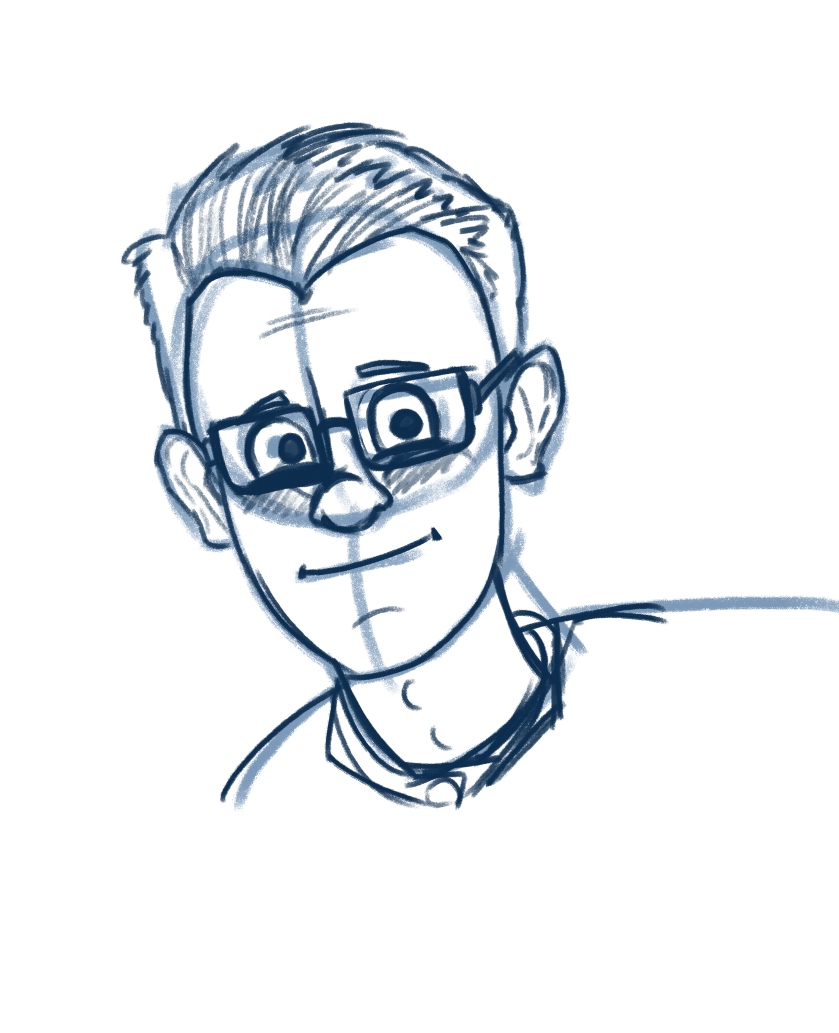
Below is a new sketch where I have designed a tilted and front facing character/ caricature design of myself. However this design looks slightly more appealing that the design above because it has more of a interesting pose instead of a generic 3/4 view.

sanderssketches_design_3_logo_v1a

Below I sketched over the top of the previous sketch to help refine this design, adjusting some of the basic shapes and overall caricature. Therefore I have slimmed the face and developed the expression to have more of a curious face, rather than a sad expression. This design is looking okay so far but there is still some development needed, as it seems to look a little off putting and a little strange looking. Therefore I need to sketch over this some more to further develop this design to get the design to where I want it.

sanderssketches_design_3_logo_v1b

SandersSketches Logo Design #3

Assignment 1: Online Publication & Promotion, Professional Development

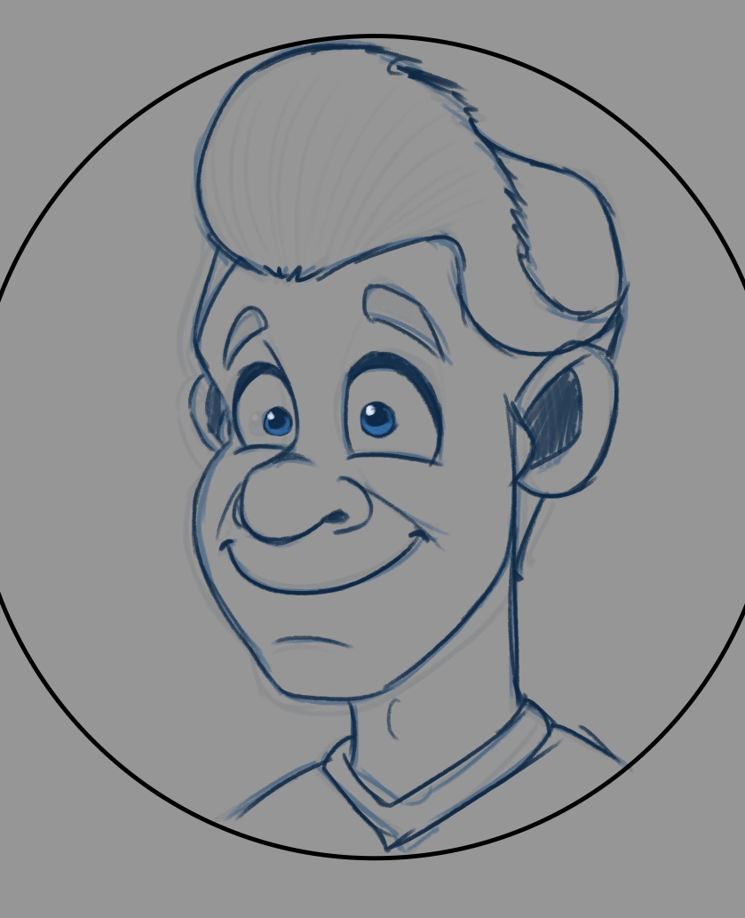
Below is a further development for my SandersSketches domain name, here I have taken some ideas from the previous designs and make a head bust of my caricature where I show a excited expression. Furthermore I have developed the previous sketch but as a close up view, but I feel like this design does not really appeal to me as much as it used to. Therefore I want to leave this design and start a new one keeping the same ideas in place but apply some different features.

domain_name_v6

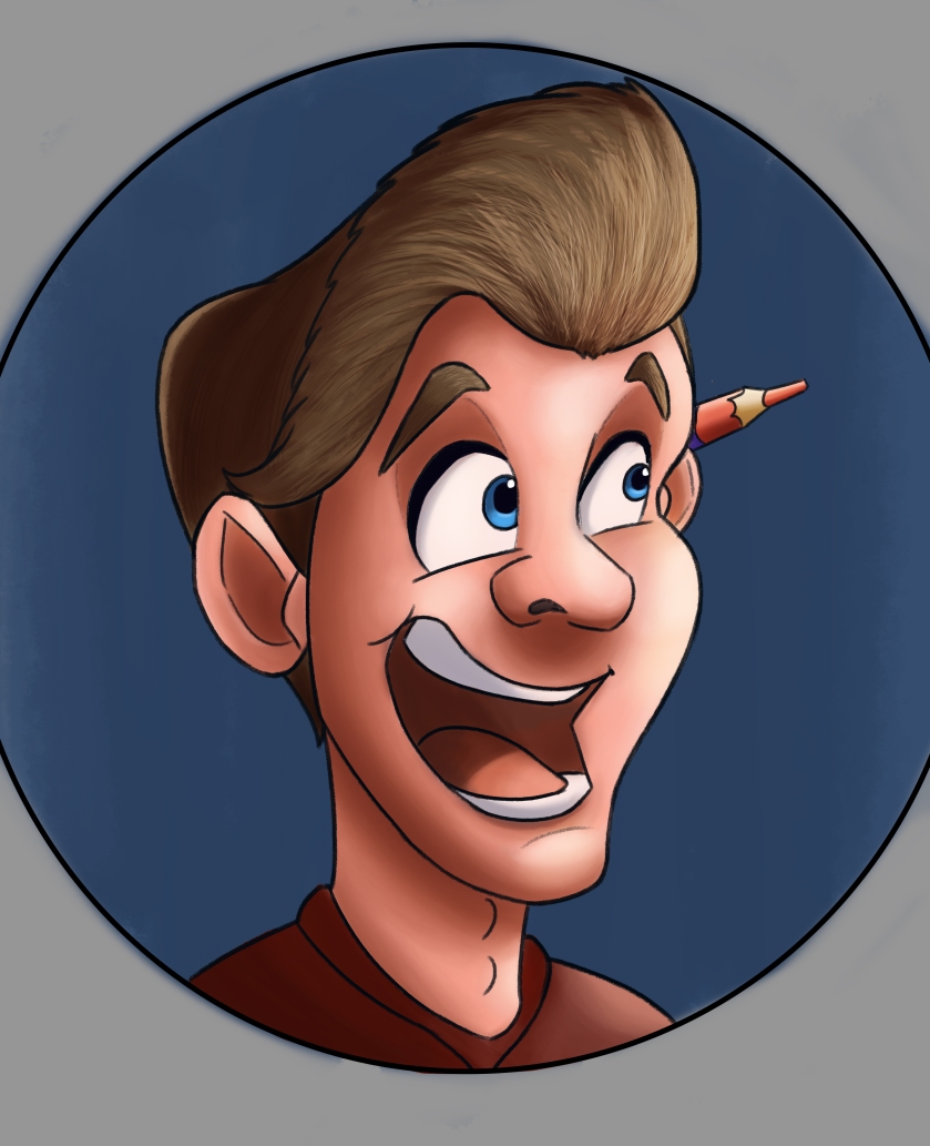
Below is my new design where I have taken the logo from this blog and the design above and combined the two together to make a pose that shows a excited pose with a Disney/ cartoon style caricature. Furthermore I wanted to add a small feature that shows my interest in art, so I added my typical double sided pencil that I use to draw/ sketch with nearly all the time. After the sketch I added some basic block colours to help form a base for the design to then build on. However I think this design shows that personal and professional logo that has a positive and creative design.

domain_name_v7

Applying some painting techniques and some of my own art style drawing skills, I have decided to develop the sketch above and build a refined painting that has a exciting and personal feel. I took the colours from the logo on this blog because the colour scheme worker really well and blends nicely. However unlike the logo on this blog I have taken more of my own style rather than Aaron Blaise to help show my own style rather than using someone else’s, this then makes a more unique logo. Furthermore I really like this design and I am considering using this as a final logo design.

domain_name_v9

Feedback

That is looking much better than what you were proposing before, essentially an updated version of your previous logo from your blog. The Aaron Blaise approach!

I would be happy for you to continue with this design, make up some alternatives. Perhaps some different angles / positions of the face.


Taking on this feedback I have decided to keep this design in mind because it has that appealing design for me, but I think that I should consider trying different expressions and angles to help influence more of a unique design. However I really like this design and I will continue to use this design as a influence to develop some other designs.

SandersSketches Logo Designs #2

Assignment 1: Online Publication & Promotion, Professional Development

Below I started with a rough sketch to try and help inspire some ideas for my logo, as I am trying to think of a logo that shows a personality as well as a art style. Therefore I thought about developing a design that shows a caricature of my face, creating some personality and some creativity for my domain. This rough sketch will be the base of this design, which I shall work at to improve and develop into a more refined and professional design.

domain_name_v4a

Below I took the basic design above and I developed the sketch into a more refined design. To do this I used multiple reference images of myself to help create a realistic caricature of myself, meaning that this design looks like me but has that cartoon/ disney esk style that I create in my art and animation. This design looks quite appealing but I think that it seems more on the realistic style rather than my cartoon/ animation style of drawing. Therefore I need to expand on this design to help get more a personality and style into the logo design.

domain_name_v4b

Thinking about my art style I decided to create more of a personality with an interesting expression and pose that shows me reacting to a drawing that is being sketched. I thought about this because it goes with my domain name as “Sanders” is the caricature of me and the “Sketches” part is the character drawing in a note pad or sketchbook. Although I like this overall character design, I think that the expression needs some development. This current expression has more of a negative affect than a positive one, which is not what I want to go for, therefore I am going to develop this particular sketch further, to make a more appealing design.

domain_name_v4c

Thinking more about this design idea I thought about making the expression look more positive with a smile rather than a frown. Plus I added this circle around the design, so that I knew what would be seen by other viewers on a Instagram or WordPress thumbnail. By adding this circle I can adjust the design so that it all fits in the circle so that the viewer can see everything without having parts of the design cut out. Furthermore I prefer this design more because it shows more of a positive view i.e it shows that I like to draw, rather than showing I don’t like to draw. I added the glasses on top of the design because I wear glasses a lot now and I thought it would look more appealing and personal in this sketch. But I think I should change the notepad into a book/ sketchbook because it is more professional.

domain_name_v4d

Taking the design above I refined the sketch with some more refined line work and then added some base colour onto the design to see how the what colour palettes I could apply to the design. I like this design because it shows that interesting and appealing design with a positive look that shows my excitement towards drawing.

domain_name_v4

However the issue with this design is that I think that if this logo was in a small thumbnail it would create a issue, as trying to see all the detail in a small thumbnail may not be seen clearly. Therefore to improve this design, I think that I should create more of just the head and shoulders (head bust) rather than a full character design, because it will not be seen clearly in a small thumbnail. Anyway I think that I need to create a simple head bust that shows a clear expression and personality with some features that show me and a art or animation style, therefore I will stick with the caricature theme but make a head bust rather than a full character design.

SandersSketches Logo Designs #1

Assignment 1: Online Publication & Promotion, Professional Development

Below I took the previous sketch I digitised the basic design just to try and give it that mirror affect, allowing me to see if there is any potential to refine the look of this logo. However like my peers said in the feedback it still has that generic feel, there is no personality to it. Therefore I will not be using this design anymore as it just has that bland, generic, shield like design that could work for a character but not for a domain.

Domain_name_V2.jpg

SandersSketches Logo design & Feedback

Assignment 1: Online Publication & Promotion, Professional Development

Below I came up with a design for a logo for the SandersSketches brand/ domain name. Because I like to draw with both digital and traditional mediums, as well as my interest in fantasy and science fiction, I designed a design showing a sword like shape with the two S with a pencil as the blade and a cintiq tablet pen as the holder. This was a simple sketch which I liked the look of so I sent it to my peers in order to get some feedback.

img_3454

Feedback

Looks very guild like, I have to say! What are you trying to get across in your branding? What characteristics do you want to say to future employers / contributors? Are you more of a classic swords and shields kind of animator or are you a fun easy going kind of chap? Your logo should also reflect your personality as well as your audience.

Taking on this feedback I perhaps need to consider a more personal touch to my logo, as in perhaps a caricature of myself like “Draw with Jazza” which shows my artistic style as well as my own personal input into the logo. Therefore I shall explore some different designs to see how I could interpret this idea into a professional and interesting logo.

Domain Name ideas: Feedback

Assignment 1: Online Publication & Promotion, Professional Development

Taking my favourite names in the list in the previous list and I sent them to my tutor in order to get some opinions on how to develop my domain names, seeing if they work or if they do not work as well.

ToonMootion:

My main question is what is the significance of the Moo in Mootion, such a specific reference to a cow leaves me to think whether this should factor into the design or not,

The name is memorable, however it sounds a little like of a piece of software rather than a singular animating entity,

The name was easy to pronounce,

The name did interest me, however in the “oh a new piece of software” kind of way, it intrigued me for new tech you could say,

I like the sketchy and traditional approach to your logo as that is a popular trend amongst animators.

domain_name_v1

I designed this logo above to go with this domain name idea, however although I liked the idea, I think the name fell flat and like the feedback suggests it seems more like a piece of software than anything else. So I will not be using this name based on the feedback that I was given.

Other domain name feedback

  • SandersSketches – This is my favorite one out of the bunch, it’s catchy, alliterative and says what it is on the tin, we know what we are going to get, this gives a more accurate and professional impression of your approach to your work
  • DanimatedArtbox – Too many parts to this name, not simple enough, Artbox infers that this is more fine art based, plus Danimation and any varients of this are so popular, you have to stand out from the crowd!
  • DanimatedToons – Same as above, however you have two references to animation here, this is overloading your domain name unecessarily
  • SandersArtBox – Same problems as DanimatedArtbox, however this is better as it is simple, more focussed

Looking at this feedback I can see that although some of the names are simple in there own way, some are hard to pronounce or do not achieve that effective interest that I thought they did. But there is one name that seems to have grabbed the attention of my peers which is “SandersSketches”. I like this name because it contains my personal surname and the type of art I do a lot of. I think this name could be quite interesting as a domain because of its simplicity and professional impression it makes. Therefore I need to develop this name with a logo to help make the brand identifiable to the others out there.

Domain name ideas: Creating names

Assignment 1: Online Publication & Promotion, Professional Development

Below are a number of domain name that I came up with using the various words I collected and put together. Some of these names are really bad and some of these have a lot of potential to be developed. Below is the list of names:

  • AnimationArtbox
  • DansAnimatedArtbox
  • AnimatedSandbox
  • Animartbox
  • SandersSketchbox
  • ToonMootion
  • ToonSkootch
  • SandersSketches
  • SandersArtbox
  • Dandersartbox
  • DandersMationbox
  • SandersSkootches
  • D.SandersSketches
  • ArtofSanders
  • ArtofDanders
  • ArtwithSanders
  • ArtbySanders
  • DanSandTooners_Art
  • DanSandTooners-Art
  • DanSandTooners
  • SandTooners.Art
  • SketchPrint
  • MoonToon
  • Sketchistry
  • Anilifedemption
  • Handipiction
  • Technimation
  • PaperPiction Studios
  • ToonLine
  • TrustToonizt
  • Toonepossible
  • MagicalSketches
  • MagicSketches
  • PaperPossible
  • ToondlePaper
  • PaperPassion
  • Artaholic
  • TeaToonsArtBox
  • DanimatedToons

All of these names above where different ideas that I have come up with by combining my name with words or by combining two random words together to see what they would make. Unfortunately some of these names became absolutely ridiculous and some had potential. Looking through these names I found that these few names could be the most effective and professional for a art and animation website.

  • SandersSketches
  • ToonMootion
  • DanimatedArtbox
  • DanimatedToons
  • SandersArtbox

I shall get some feedback on these names to see which is the most appealing and interesting to my peers, and which one sends that clear and professional view of a website that represents art and animation.


Domain name idea generation

Assignment 1: Online Publication & Promotion, Professional Development

Having some trouble with designing/ coming up with some interesting domain name ideas, I researched some ways to inspire a domain name. Below are the idea generation techniques I used from some research.

  • List of random words (5 mins)
  • Run these words through “Thesaurus.com”
  • Slang words as well
  • Add you name and nouns for what you do
  • Descriptive words
  • Get creative and make a few of your own words
  • Putting few words together and see what you come up with.

Now using these different idea generation techniques I listed a wide variety of words that relate to animation or art in order to promote my own online domain for my professional website.

Art, Drawing, Toon, Cartoon, Animation, Sketch, Doodle, Design, Character Design, Illustration, Artwork, Gallery, Studio

Craft, Artistry, Craftsmanship, Imagination, Knack, Work of Art, Painting, Tracing, Picture, Outline, Graphics, Depiction, Moon, Boon, Town, Caricature, Action, Passion, Bounce, Energy, Exhilaration, Zing, Vitality, Dynamic, Life, Excitement, Zest, Blueprint, Digest, Shape, Syllabus, Version, Configuration, Draw, Scribble, Tinker, Conception, Idea, Formation, Perspective, Scheme, Architecture, Interpretation, Specimen, Analogy, Handicraft, Handiwork, Technique, Arcade, Mezzanine, Upstairs, Salon, Workroom

Sanders, Dan, Redemption, Advice, Belief, Compassion, Reality, Love, Wisdom, Help, Hope, Freedom, Trust, Heroism, Promise, Brood, Jury, Squadron, Anyone, Inside, Clan, Corps, Regiment, Photograph, Overthrow, Somewhere, Paperclip, Lightening

Acting, Deceiving, Destroying, Questioning, Painting, Travelling

Toonizt, Tooners, Artbox, Lightbox, Fire, Colour, Impossible


All the words above are a collection which I shall combine together in many ways to try and figure out a appropriate, effective and professional domain name for my website and art social media pages (Instagram, Artstation, WordPress, etc)

Now I shall combine these words and make a list of names that could potentially become a professional domain name for my website.
Professional Development: Deadline tasks

Assignment 1: Online Publication & Promotion, Professional Development, Uncategorized

A4 Ring Binder

  • Introduction
  • Self promotion- why we need it?
  • How important it is?
  • What can you use?

CV plan- CV Graphical

Business cards

  • Review design styles
  • Design your own
  • Where can we print them?

Why do we need a website and examples. reviewed and your website with bits on.

Website developed plan

  • Another self promotion example

Sites to use:

Section 2

  • Keeping skills up to date
  • How will we do this
  • Long courses (Masters)
  • Short courses
  • Online courses
  • How may they help you
  • What are your transferable skills- mapping
  • Visual rural map- what areas you could go into development plan

A3 Folder

  • Range of Visual work
  • Concepts
  • Environments
  • Life drawing
  • Storyboards
  • Still of Animation
  • Characters

10- 15 pages max!

  • Might even make a concept development visual book
  • Some of you might walk in range of areas

Website

  • Face page
  • Bio
  • Image
  • Technical skills
  • Your work
  • Concept art
  • Character designs
  • Environment art
  • Storyboards/ beatboards
  • Still of Animation
  • Final animations
  • Line tests
  • Rig process
  • Life drawings
  • Contact details

Employment database (Contact, responses, CV sent)